


How branching out beyond your position description will give you an edge
Designer stories: Generating your own content and marketing.
With roles in certain industries becoming more multifaceted, it can be important to branch out into other areas to build your skill set.
This idea was backed up in a blog I recently wrote about how designers are often encouraged to also write content, code and study business.
To summarise, it was basically about how designers are told (a lot) to learn elements of other professions and how it can be kind of annoying to hear that....but also true.
The blog then delved into the many benefits of being multi-skilled, with some workplaces encouraging their staff to learn new skills outside of their job description.
So, in keeping with this theme, we're always encouraged here at SEED to take on autonomous projects and ideas – as long as they can be validated.
Our Chief Technology Officer, Mike Ebinum, had been gently nudging me to create an infographic as an interactive web page for a while, so I just needed some data and a topic to get started.
But, when I finally found the perfect data, little did I know I'd be creating much more than just the design project.
I also took on the role of project manager making decisions about how the project would look and how it would benefit consumers.
When the project was finalised and it came time to marketing the idea, I put on my communications cap and distributed the data story to the right media contacts and social media channels for promotion.
The response was unexpected and I felt a sense of satisfaction having managed the entire project from start to finish.
This blog will go into how we came up with the idea, the tools we used and the results.
about-seed
The problem
As a football nerd (AFL that is, sorry not sorry, soccer folks) I was watching a game one day where a player was being lorded over by the commentators for having 35 disposals, saying he had a 'great game'.
If anyone is unfamiliar with the word 'disposal' it really just means
However, no one was talking about how this player had no opponent on him for most of the match and that he had missed about five easy tackles (very bad).
To make things worse, about half of those disposals (stats, remember) went straight to the opposition!
I was left thinking:
If data is the only tool we looked at, it's easy to lose the importance of story and context.
Although data and statistics can help determine and validate ideas, it shouldn't always inform 100 per cent of the overarching story.
The idea and solution
The idea came from a combination of witnessing the frustration above (a lack of an overarching story and context) and also wanting to use data to create a live infographic.
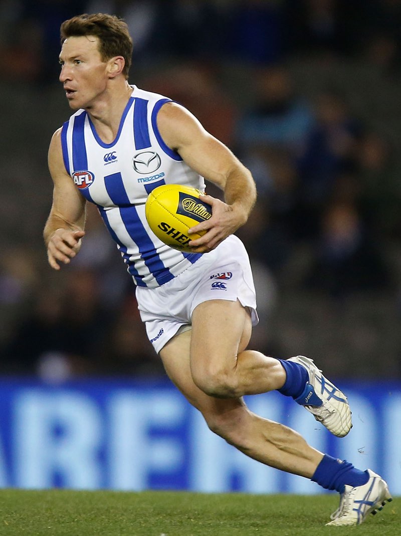
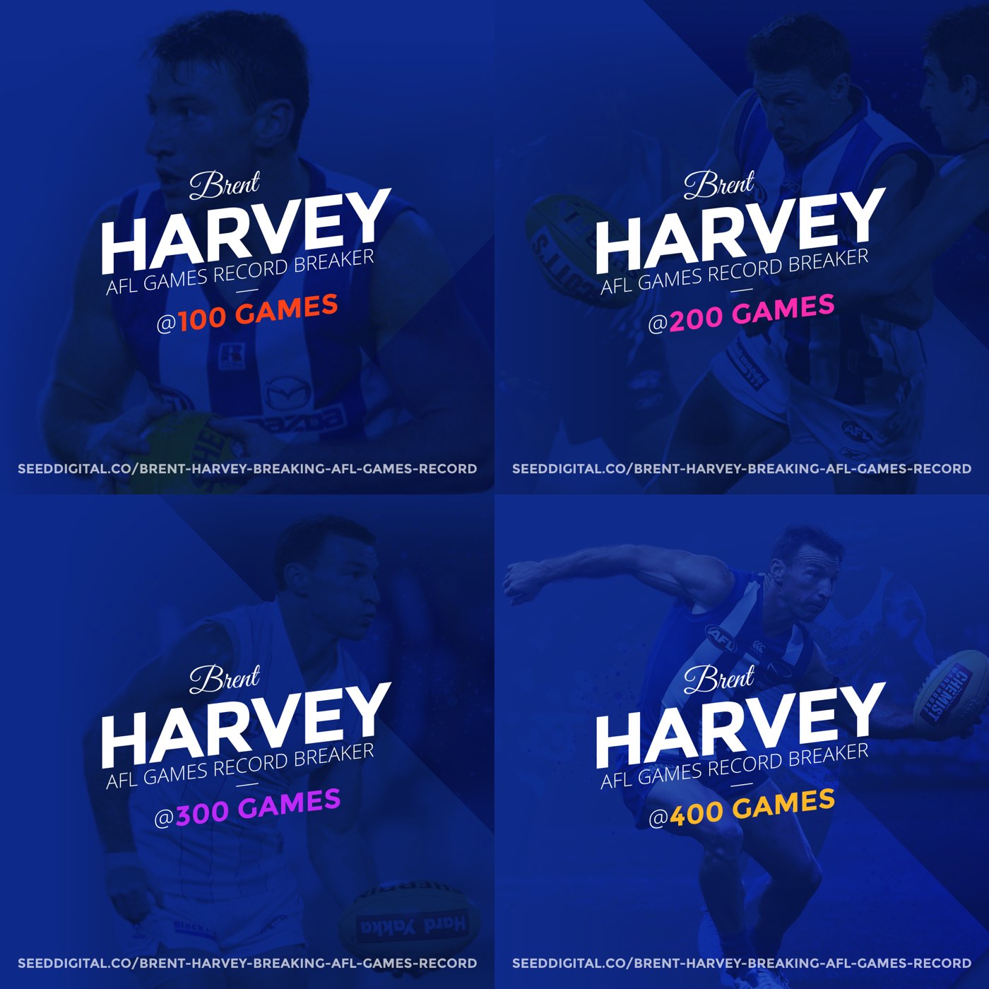
With North Melbourne champion Brent Harvey poised to break the VFL/AFL games record of 427, late into the 2016 season, this was a perfect opportunity.
This was huge news for the club, the fans and the AFL, not to mention Harvey himself.
The bonus was – I'm a massive Roos fan!
We would go on to combine data and imagery in the context of
When trying to explain the project out loud, 'live, interactive, infographic, with data visualised storytelling in a responsive web application', wasn't really selling it.
So, we called the project a 'Data Story'.
While the design and build side of the project was a labour of love, I was surprised how much I enjoyed the marketing and promotion side.
I also learnt a lot about how to efficiently promote content using some interesting tools which we'll explore later in the blog.
Why we did it
A number of factors went into why we would want to create something like this at SEED:
To create something new/evolve what currently is
We wanted to solve the problem of just having data and statistics in sport or just having an article written about a player's career.
Both areas were to compliment each other.
Clout
Credibility is a big deal when prospective clients are trying to decide who they want to partner with. Having a few different
Persona targets
Firstly, if you're unsure what personas are, check out SEED General Manager Christopher Bartlett's whitepaper on personas.
It’s helpful to know who you are targeting your content to, and the whitepaper can help you distinguish this.
To target our Data Story we created personas on who we wanted to target our content to.
Our targets were broken down into six personas – founders, innovation managers, executives, industry professionals, venture capitalists and journalists.
For example, SEED Software Engineer, Timon Sotiropoulos wrote a blog on how to land your dream job after uni, this would be directed towards industry professionals.
Another example would be Christopher Bartlett's whitepaper on the business model canvas explained. This was more aimed at founders looking for guidance, but it also allowed venture capitalists, innovation managers and executives to see our abilities and processes at SEED.
The Data Story crossed all of our personas;
- It is clout and proof of creativity and technical know-how for founders, venture capitalists and innovation managers;
- It’s shareable content for journalists;
- It's perfect for the industry professionals who are interested in the design and build side of things; and
- It’s a well-known topic and event (in Australia) which would reach a wider audience.
How we did it
Design and build
Here are the tools we used to create the data story.

Paper and pencil
To try and form the idea we had in our brains, we sketched out some
Once we had a good idea on what the wireframe would look like, it was then time to move to a higher level concept.

Sketch
We used Sketch to create and validate a higher level wireframe/design hybrid.
Sketch
We'd previously written a basics of Sketch, outlining its advantages and how to use it.

Affinity Photo
Recently, we traded out Photoshop for Affinity Photo and it’s been awesome.
Affinity was used to design all of the imagery like the main banner and the main background image in each section.

Webflow
Webflow is what we built the Data Story in. It’s a web application platform which enabled us to design and build our responsive data story site.
We love Webflow here at SEED!
Marketing and promoting
Here are the tools we used:

Prospect.io
Basically, Propect.io can copy any email that shows up on a page once the Chrome extension is installed.
The extension especially works well in LinkedIn, by gathering email addresses on the current page.
We used this tool to build targeted lists to distribute our Data Story. It also gave us great insights about who had opened the email, who’d clicked the link, and so on.

Buffer
Most people know about Buffer. If you’re not sure what Buffer is, it’s a tool that allows you to schedule content to go out
This enabled us to plan and schedule our content leading up to the record-breaking game, and beyond.
The results
Instagram is a great use of social media for anything visual.
The use of hashtags makes your post discoverable and with the introduction of Instagram business, we could now add a link to SEED's website, add a business address and contact button.
Twitter is pretty much a staple for producing and sharing content.
After some research, we discovered we needed to add images to tweets as the click rate on tweets with images far outweighed tweets with no images.
From the result of the Propect.io email campaign, Twitter seemed to be the main stream in which recipients were keen to share the piece.
Leveraging some journalist connections, The New Daily included the Data Story in an article written by former North Melbourne Kangaroos coach Denis Pagan.
Followers: 12.6k

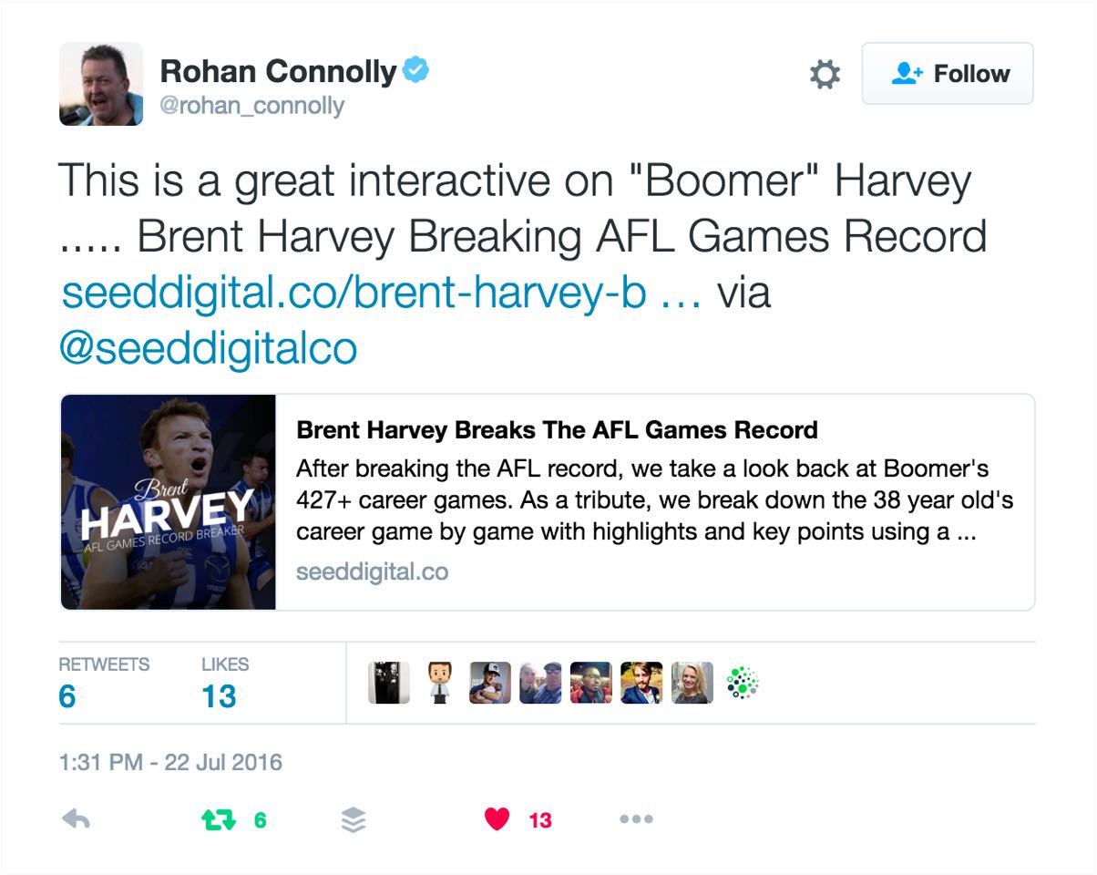
Rohan Connolly is a senior AFL writer at The Age and was kind enough to send an email to us saying he would share the Data Story via Twitter.
Followers: 37.4k
Breaking though with either the AFL or the North Melbourne Football Club was always going to be difficult, mainly for the reason that they like to produce and control their own content, which is understandable.
Even so, the North Melbourne media department shared the tribute to Boomer. (Go Roos!).
Followers: 58.4k

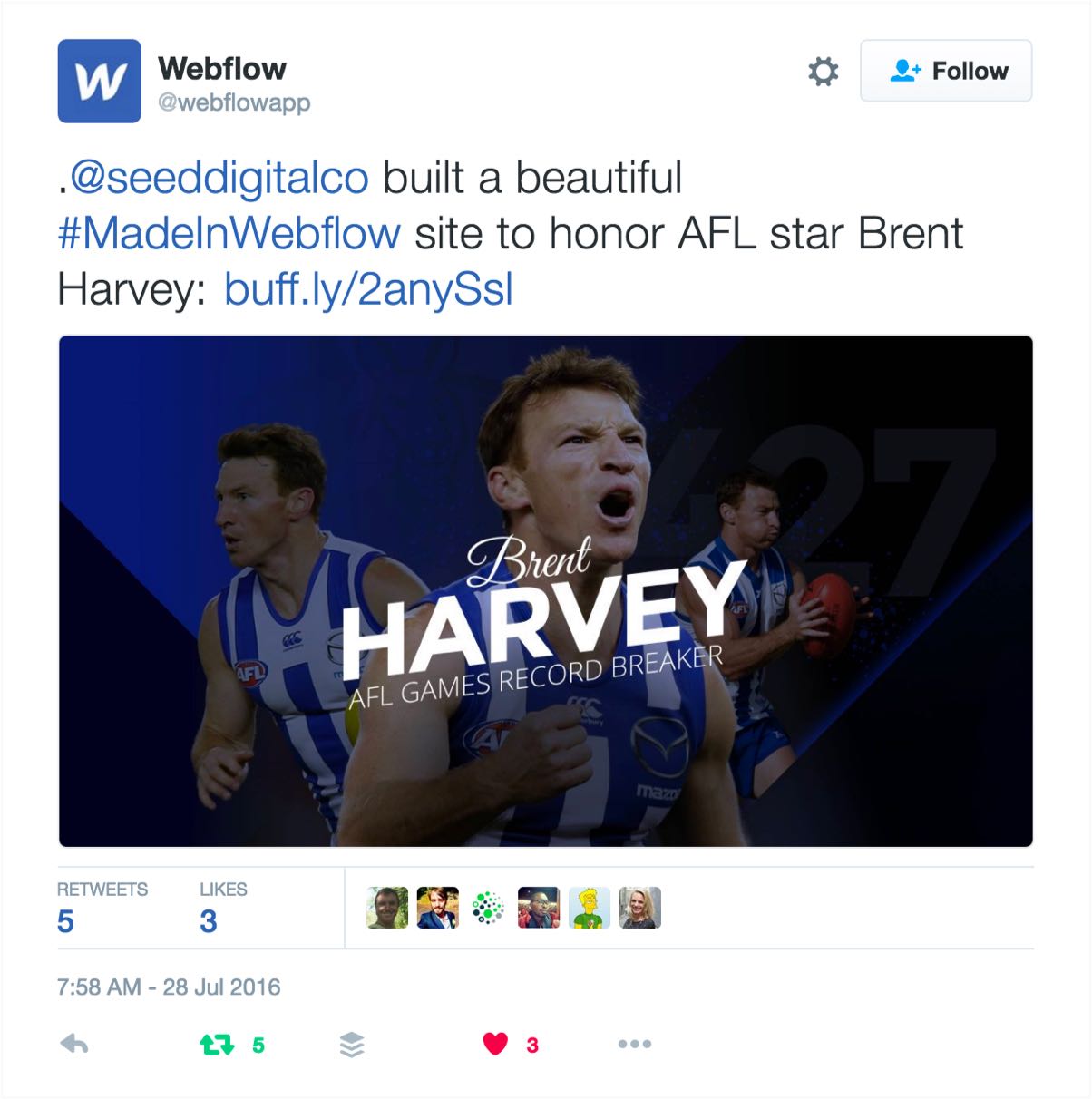
When trying to think of any other potential targets, Timon Sotiropoulos, our software guru, asked me: 'What did you build it in? You should show those guys'.
Good advice. In a seperate Propect.io campaign we targeted our friends at Webflow, the platform we built our Data Story on.
Followers: 8k
The reach from Facebook for the week leading up to the game was about 5,000 users, of which about 3,500 were organic.
Networking
Apart form generating exposure and leads to the site, we met with various sporting companies about what we'd done.
From these meetings, we are now looking to develop future projects like this one.
Reusable content
Keep in mind, when you're taking the time and effort to create something like this, that this piece of work is reusable. It's not just a one-time thing.
Harvey became very topical again when he announced his retirement after the 2016 season. This was a good chance to re-share the Data Story on social media.
Another way this project can be used is by showing it to potential clients. This informs them what can be done in terms of design, frontend development, responsive web applications and displaying data visually.
On reflection
It wasn't until I was working towards the end of the project that I realised I had done this all before.
After North Melbourne had won the 1996 premiership, the 13-year-old me decided to go out and buy all the newspapers, magazines and promotional material I could get my hands on and make my own 'infographic'.
I believe it was called a 'collage' at the time.
I did this by cutting out all the player's pictures, logos and stats then gluing them on a massive piece of cardboard. #oldschool
Anyway, designers do have an edge when moving through different areas of a business.
In fact, everyone can.
When you're learning frontend web development skills, designers can create, crop and cut up their own images.
If you're learning business, designers can style their own documents and inform decisions with a design perspective.
When designers create their own content, they can now market it with much success, too.
Oh, and check out the Data Story!
Want some help on building your startup, growing your business and creating products/services that your customers will love? Contact SEED to make an inquiry.